|
|

|
|
Hi again!
If this looks different to you, it’s because it is! We are currently migrating from one ESP to another and we thought, why not introduce a new design, too? This has been quite an adventure, to be honest, and I can’t thank Anthony Noel enough for his problem-solving skills and his patience (more like, sainthood) in coding this new layout. That said, if you’re reading this in gmail, especially if you have dark mode enabled, you’re probably not experiencing the real thing, so I encourage you to take a look at it in your web browser.
Enjoy!  Noemi Noemi
|
|
Font family of the month
|
|
|
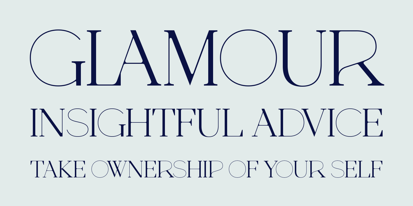
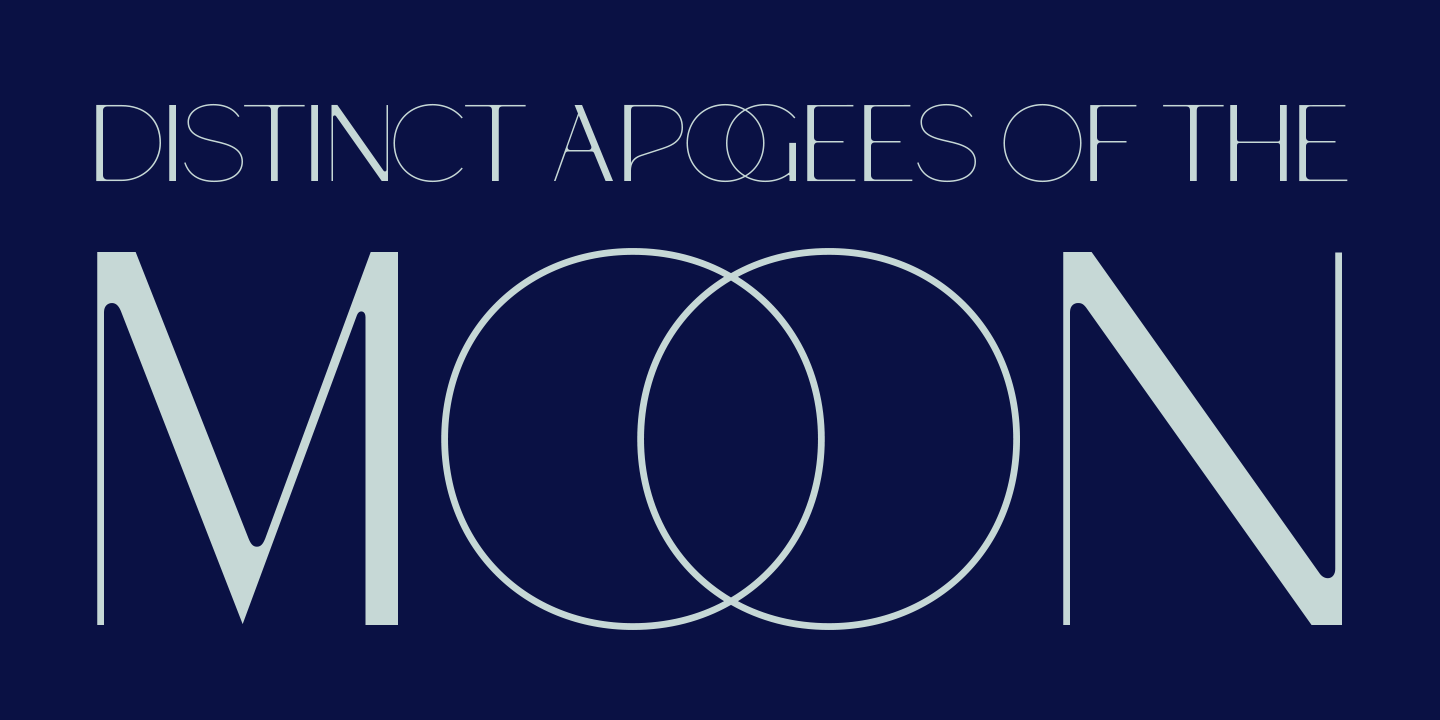
Faubourg by Marie Boulanger
|
|
|
|
For this edition of the Fresh Fonts newsletter, the spotlight is on the two-weight display family Faubourg. Released by Positype, Marie Boulanger’s debut typeface is a formal experiment in combining elements of French Art Deco with eighteenth-century transitional serifs. Suited for branding and headlines, Faubourg’s unexpected foray into hairlines, and mash-up of shapes give it a recognisable and delightful charm. |
|
|
|
From partner foundries
|
|
|
|
|
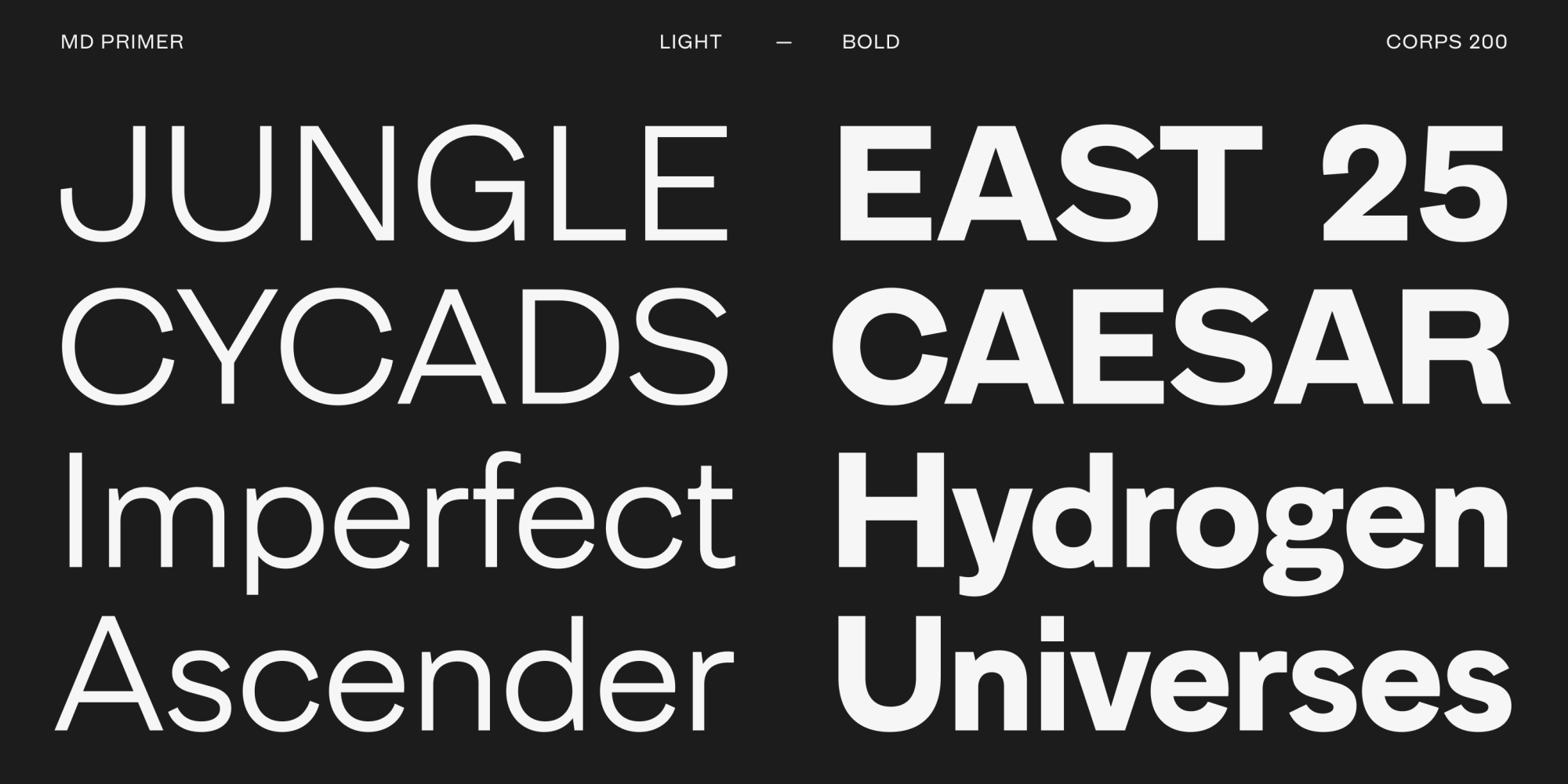
Welcome Mass-Driver, our newest partner foundry, and their new grotesque, MD Primer. MD Primer revels in the quirks and inconsistencies of early sans serif designs, and is available in five weights. Not to mention, when you purchase fonts from Mass-Driver, you can do so under their new licensing model, a simple system which determines price based on the size of the company using the fonts, rather than on the number of actual users.
🎁 Save 50% foundry wide at Mass-Driver with our Half Price Card
|
|
|
|

|
Pangram Sans Rounded by Pangram Pangram
|
|
|
With support for Latin and Cyrillic scripts, Pangram Sans Rounded joins the already extensive Pangram Sans Collection. The design includes upright and italic fonts, along with a not-often seen back-slanted Reclined style – and this in six condensed widths. The sausage shapes, especially in the heavier, slanted styles, will add a playful edge to your next project.
🎁 Save 50% foundry wide at Pangram Pangram with our Half Price Card
|
|
|
|
Fresh releases
|

|

|
|
|
|
Designed by Robert Janes, Gravity is a display font in as many as twelve widths, ranging from XXXX Compressed to Wide. Special positioning features will let you make its letters jump over the baseline or hang from the top, while its many stylistic alternates will let you create playful, super compact title arrangements. And because Dinamo is Dinamo, along the typeface was also launched a stretchy resistance band to put Gravity – and your fitness levels – to the test.
|
|
|
|
|
|
|
|
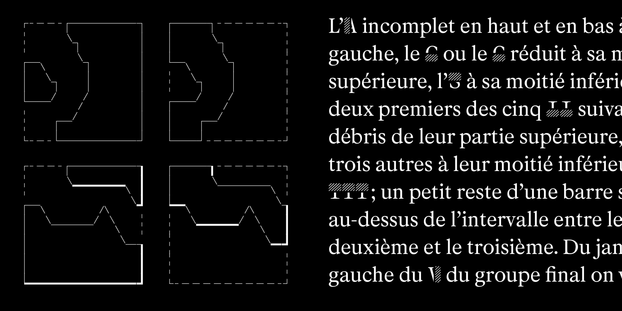
Charles Mazé’s Mercure draws from mid-nineteenth century typefaces crafted for transcribing classical inscriptions in print. The result is a tight-knit family comprising three styles (Regular, Italic, and Transcript) along with a set of fragmented, false, broken or missing letters and symbols that were used for transcription. Together they offer a unique palette that can be imaginatively used for branding and editorial design.
|
|
|
|

|

|
Staff Grotesk by Rui Abreu
|
|
|
Staff Grotesk is a welcome addition to the multi-width Staff family. Tempering the unusual features and large-size letterforms of his extensive neo-grotesque, Rui Abreu has created a new sans serif design intended for text settings. This subfamily, Staff Grotesk, comes in four weights and matching italics, all while keeping the integral vitality of the original.
|
|
|
|

Self Modern in use on the website of Usted
|
Self Modern by Bretagne Type Foundry
|
|
|
Designed by Lucas Bihan, Self Modern finds its inspiration in traditional serif Japanese typefaces. The deep ink traps, wide proportions and eccentric details in the uprights, and the reverse contrast in the italic make this one a stand out design. Extended weights, drawn in collaboration with Roxane Gataud, were added to Self Modern this year.
|
|
|
|

|

|
Tempel Grotesk by Raymund Schröder
|
|
|
Stemming from wood type, Production Type’s latest offering, Tempel Grotesk, makes a strong impression. Its chunky, heavyset letter shapes, and the white spaces within and between them build a rhythmic visual cadence. Available in four widths from condensed to wide, it provides a ready toolkit for making striking typographic compositions.
|
|
|
|
In case you missed it
|

David Jonathan Ross’ Forma is now available as a variable font, with two new additional weights: Hairline and Black.
|
|
↗︎
|
Jaune by Jérémy Landes has evolved into three optical sizes and was published at NaN, with a fun, new minisite.
|
|
↗︎
|
Lava, Typotheque’s multilingual text typeface, now comes as a variable font with an axis that automatically optimizes the font’s tracking based on its point size. |
|
|
Goods
|

Last days to back Marie Boulanger’s unique book on the relationship between gender stereotypes and design practices!
|

Fancy a new rug? Check the ones designed by Balmer Hählen in collaboration with Chic Cham.
|
|
Why pay for Fresh Fonts?
We’re fully supported by our members. We don’t run ads. We don’t sell your data. Our responsibility will always be to create the best products in the interest of our members and our values. Plus, you’re supporting an independent business.
For only
5$/month
|
|
|
Thanks for reading!
If you liked this newsletter, why not forward it to a friend?
|
|
Fresh Fonts is curated by Noemi Stauffer and Christophe Bouche, two creatives who are passionate about discovering original type design work from around the world.
How would you rate this month’s newsletter?
Great | Good | Meh
|
|
|
|